SARAH MASON PHOTOGRAPHY – BRAND
When friend & fellow collaborator Sarah Mason wanted a new brand for her company it was a bit of a gift to be honest. I’ve worked on lots of projects with Sarah, and we both ‘get’ each other and how we work.
It’s not often I would share the source inspiration for something like this, but it all came from a visit I had to a vintage shop in Adelaide South Australia whilst working there. Sarah & Suzi were celebrating the news of the imminent arrival of baby Olive, and instead of the usual card, I spotted this 1960s Kodak photo wallet. So I bought it for a dollar (50p) and added my message on a card, then slotted it in the wallet.
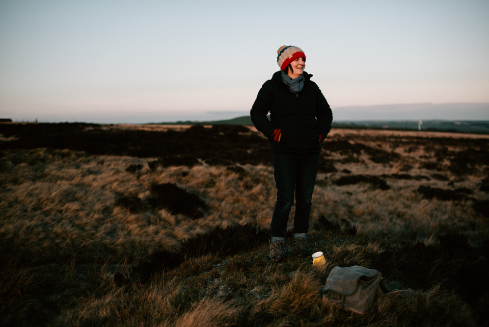
When they asked me to create their branding, I went back to this wallet. Because, to me it summed up everything about them. Sarah’s work often has a nostalgic feel, and this is her speciality. She somehow manages to capture magic that is often unseen by most. When she has been working on a project with me, I’ve sometimes said “Shall we start?”, and she’ll say, “I’ve already got the shot”. And she invariably has.
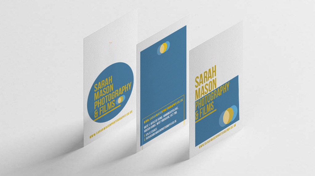
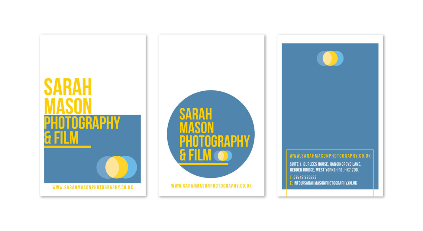
For the brand logo design, I studied old film and video boxes, from 50s – 80s alongside those icons you see at the end of vintage films. I always associate blue skies & autumn hues with Sarah’s work, so I brought in those colours.
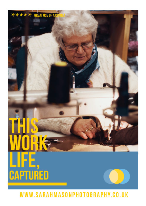
TAGLINE: THIS WONDERFUL LIFE, CAPTURED
Nearly alway, the hardest part of the brand is the strap-line. I went backwards & forwards with this. But in the end, Sarah’s work is about celebrating life. Whether that’s family life, work life, life adventures – people are always at the centre, and a celebration of who they truly are is the key.
So ‘This Wonderful Life’ came from that. I love how the words sound together. This, being specific, Wonderful being celebratory & Life being at the centre of the work.
Then – Captured – that split second that eludes most people, the one that can sum up everything about a person in one photo. That’s the true art of photography. And Sarah has it in spades.
We even had a discussion about the use of the comma! How that pause made all the difference (brand geekery here!). We were rewarded when we launched the brand by a tweet that said “Fabulous use of a comma”. Job done.
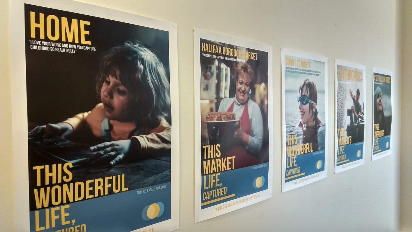
We used variations of the strap-line on these ‘film posters’, highlighting Sarah’s beautiful film work.
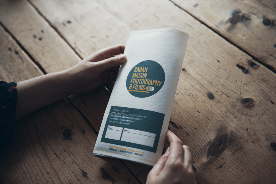
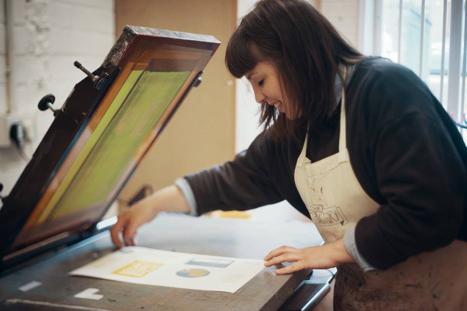
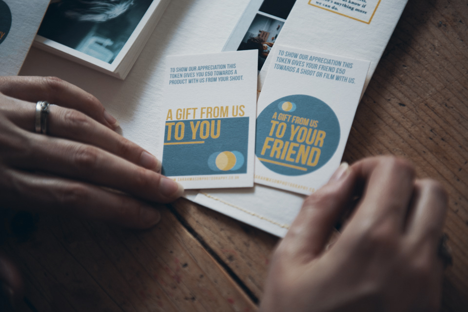
The original vintage wallet was a big influence for everything. So it made sense that we recreate it for customers who have had family photoshoots. I’d found some paper that goes through the same treatment process as leather, so it lasts for years and is really tough.
Here’s a film about the whole process.
We took that to Amy who runs an art centre (The Egg Factory) in Hebden Bridge, and she screen printed and stitched the wallets – all by hand.
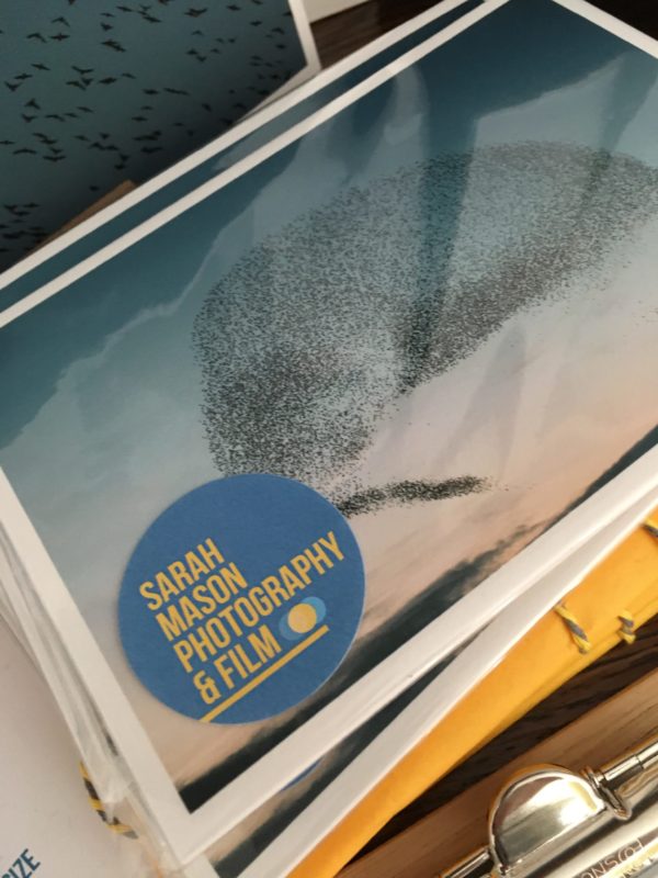
Sarah’s prints are all printed locally too. This is really important to Sarah, supporting local businesses and using expert craftsmen as part of her brand.